Geographic Information System Art
|
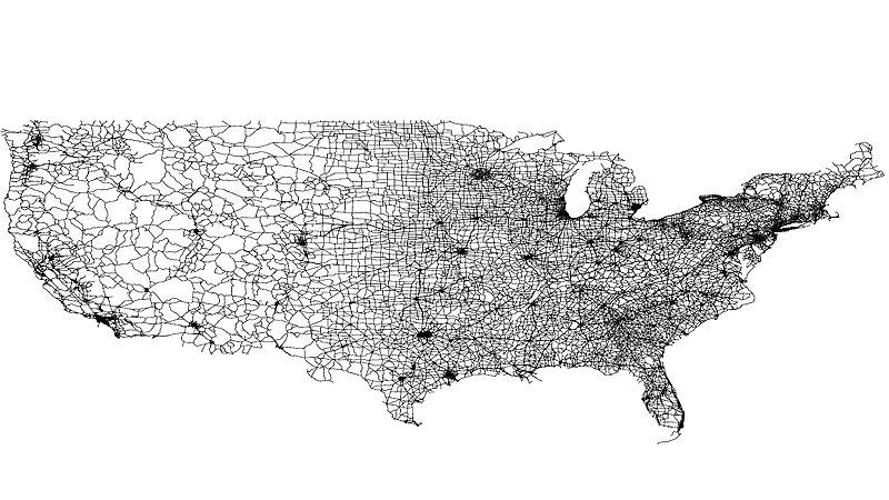
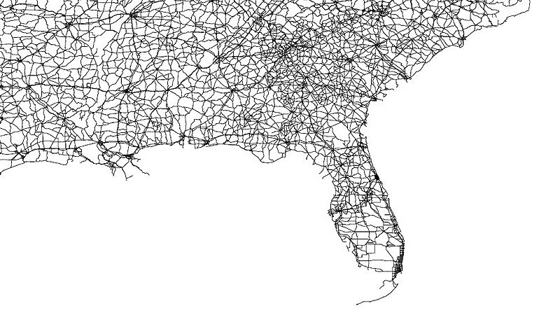
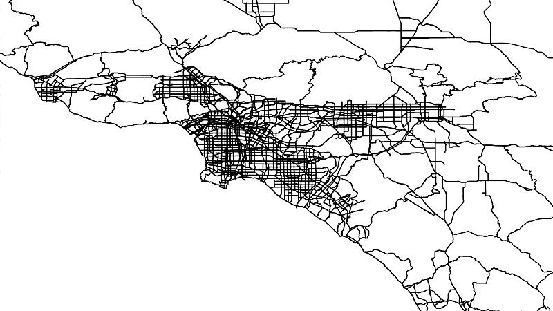
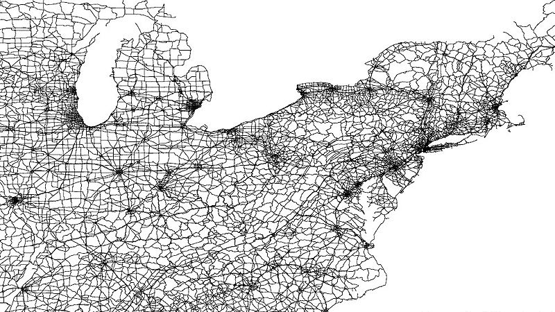
Data visualization based on minimal info… By using exclusively open source software and open source data it is possible to visualize all the major roads in the USA. The most wonderful of things happen and you can clearly distinguish the country and even cities by looking at the major roadways alone. Is it possible to create art from data and if so what would it look like. Is it possible to create art from data that doesn’t cost anything? A series of tests that kind of look artful in itself. For this experiment we installed the open source/ freeware GIS ( geographic information system ) software called Q-gis an open source PDF writer ( such as CutePDF) and some publicly available data ( Us roadways GIS info ) plus a little brain damage on our end . These test are on 24×36 print, line weight 0.25. Will post additional information when I find better data. |